
… for washing your hair too, allegedly
Until very recently I had no idea I might acquire an interest in phillumeny, even if I knew what it was.
But thanks to a random purchase in an auction sale, I have discovered that phillumeny means an interest in everything to do with matches – particularly collecting matchbox labels, matchboxes, matchbook covers, matchbooks and other forms of packaging for all kinds of matches, among other luciferous things.
I’m endlessly fascinated by all collections, so when a lot came up in a tatty old box containing a ready-made “matchbox collection”, I couldn’t resist and snapped it up.

“Why the long face? ” That’s comedy…
On getting the box home I found it contained several hundred matchbox labels – most of them still stuck to the wooden or card sides of the boxes from which they’d been ripped off. Again most of them seemed to be roughly around 100 years old or so – and featured a dazzling array of often very elegant early 20th century commercial graphic designs.
I was previously aware of the more modern, colourful graphic style of mid Century matchbooks from America, Europe etc, but the simple one or two colour designs on these early matchbox labels from the UK, Belgium, Sweden have been a revelation to me.

Sets of three objects were very popular on matchbox labels
They’re so redolent of the hellish and dangerous Victorian factories where “friction” matches and later “safety matches” were manufactured, of a period when it was exciting to have “instant fire” in your pocket to light up a stove, a gas lamp, a pipe or a “gasper”, when rooms smelt of sulphur and were dim and foggy with smoke.
Jane, too, was instantly “lit up” (first pun, seventh paragraph – that’s restraint) by the charmingly grubby collection I’d acquired, and we decided that some of the labels could be worked on to create handsome prints – the kind that would add a “striking” (sorry) touch of vintage style to a kitchen wall, perhaps.
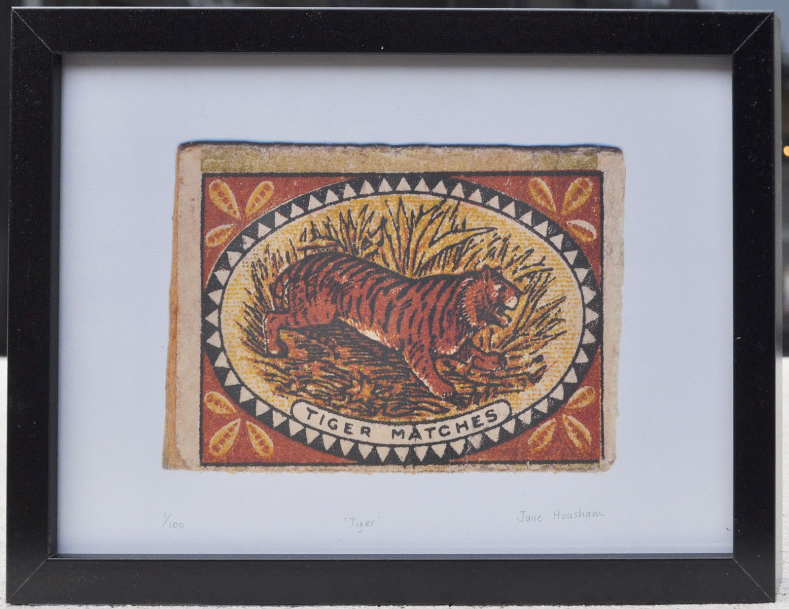
Tiger matches burning bright…
We’ve put some in our shop on Etsy – and we think they look great. Have a look yourself and let us know what you think…

The source of a “brew” possibly not quite as popular with smokers as beer…
David
